
How to Create a Watercolor Mixing Chart in Depth Guide
Watercolor mixing charts serve as a roadmap to understanding how colors interact and transform on paper or canvas. We'll cover foundational steps briefly in this article, then deeply talk brand comparisons and applications. A key focus is skin tone mixing—a common query tied to "watercolor skin tone mixing chart"—which demands warm/cool balance, transparency, and value control for realistic results. Naturally transitioning from basic tools, we'll explore skin tone as a practical application, featuring Phoenix's dedicated Skin Tone Watercolor 12 Colors Tin Box. From there, we'll extend to the advanced realm of portrait painting, where skin tones capture light, shadow, and diversity in human expressions. If you're solving real problems like "how to mix authentic skin tones," this aligns perfectly—portrait art painting often drives such queries, turning your chart into a powerhouse for lifelike works. Let's begin.
Color Theory Basics: A Quick Refresher for Professional Mixing

While entry-level guides saturate searches for "color mixing chart" or "color chart for mixing colors," we'll keep this refresher concise, emphasizing mid-to-professional applications. Watercolor thrives on primaries (red, yellow, blue), secondaries (orange, green, violet), and tertiaries, but advanced work hinges on warm/cool biases and pigment dynamics.
Warm hues (e.g., Cadmium Red's fiery undertone) infuse energy for dynamic compositions, while cools (e.g., Phthalo Blue's crisp depth) add recession for atmospheric effects. Complements—wheel opposites—are vital for neutralization: blue + orange yields muted grays, preventing vibrancy clashes in sophisticated palettes. For pros, pigment properties are key: single-pigment options ensure purity, minimizing mud in complex blends like those in a watercolor mixing chart.
Here's a targeted table comparing warm vs. cool primaries, with advanced tips:
|
Primary |
Warm Example |
Cool Example |
Advanced Mixing Tip |
|
Yellow |
Cadmium Yellow (Warm bias for glowing earth tones) |
Lemon Yellow (Cool bias for ethereal greens) |
Warm + Cool = Nuanced neutrals; layer in glazing for depth in skin tone charts or landscapes. |
|
Red |
Cadmium Red (Warm for vibrant flesh) |
Alizarin Crimson (Cool for shadowed moods) |
Cool tempers warm to avoid dullness; test ratios in your mixing paint colors chart for portrait shadows. |
|
Blue |
Ultramarine (Warm for violet-rich granulation) |
Phthalo Blue (Cool for turquoise intensity) |
Mix opposites for textural grays; ideal for pro granulation in abstracts or skin undertones. |
This sets up charts for intuitive, high-level control, bridging to advanced customization.
How to Create Your Watercolor Mixing Chart
Competitor content often repeats simple grids and theory, but for mid-level artists, we'll integrate pro elements like value scales and bias tests from the outset. This fills gaps in "watercolor mixing chart" resources, focusing on efficiency for real projects.
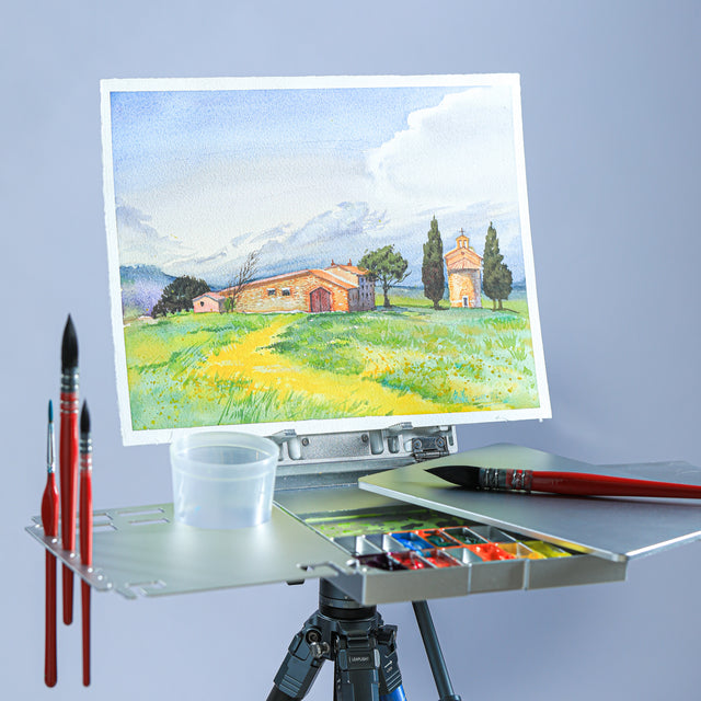
Gather materials: 100% cotton paper for even flow, round brushes (sizes 6-8), a palette, and 6-12 colors—Phoenix Artist excels with lightfast, translucent options for layered work.
Materials Prep: Choose a spectrum-ordered palette (yellows to blues). Phoenix's pure hues, like Lemon Yellow Hue, ensure clean starts in any color mix chart.
Grid Setup: Sketch an 8x8 grid lightly; label rows/columns with names. Add dilution columns for values—essential for pros testing transparency in a mixing paint colors chart.
Painting Process: Diagonal pure swatches first, noting granulation. Mix intersections (50/50 base), cleaning brushes to avoid contamination—a frequent pro oversight.
Pro Customization: Include dominance tests (70/30 ratios) to reveal biases, turning your watercolor mixing chart into a dynamic tool for nuanced harmony.
This 1-2 hour process yields an evolving reference. As Reddit users advise, snap photos for digital access.
Advanced Guides: Depth for Professional Artists
Most "color mixing chart" guides stop at basics, ignoring pros' needs for sophisticated analysis—like ratio experiments, granulation control, and thematic adaptations. Here, we'll delve into these, enabling charts that solve complex issues like luminous veils or texture in multi-layers.
Begin with ratios: Beyond 50/50, a 70/30 (dominant warm + subtle cool) yields tertiaries with controlled vibrancy, ideal for avoiding shifts in pro glazing. Granulation adds texture: Test pigments like Ultramarine on your chart; their settling creates organic effects for atmospheric works, a gap in beginner-focused content.
Theme charts elevate further: An "earth tones" variant (Yellow Ochre + Burnt Sienna) grounds landscapes, while a "glow" chart layers translucents (Quinacridone Magenta over yellow) for ethereal luminosity—perfect for advanced abstracts.
A critical advanced application is skin tone mixing, where charts bridge from tool to artistry. Searches for "watercolor skin tone mixing chart" highlight this challenge: skin requires warm/cool equilibrium to reflect diversity, with transparency preventing opacity and values controlling light/shadow. Use your chart to test bases (warm yellow/red for fairness) and adjustments (cool blues for depth), ensuring inclusivity across tones.
Phoenix's Skin Tone Watercolor 12 Colors Tin Box is ideal, with peaches, browns, and golds blending without chalkiness—high transparency supports wet-into-wet gradients. For example, mix golden hues with reds for warm undertones.
Explore this set here for chart customization.
Skin tone mixes table (Phoenix focus):

|
Base Color |
Mix With |
Ratio |
Result |
Pro Insight |
|
Yellow Ochre (PY42, +++ lightfast, Transparent) |
Cadmium Red Pale Hue (PY65/PR255, +++ lightfast, Transparent) |
60/40 |
Light Peach |
Warm for fair skins; glaze for glow—analyze values to mimic professional portrait lighting. |
|
Burnt Sienna (PR101, +++ lightfast, Transparent) |
Ultramarine (PB29, +++ lightfast, Transparent) + Rose |
50/30/20 |
Medium Olive |
Cool for diverse mids; granulation adds texture—test for ethnic accuracy in advanced charts. |
|
Vandyke Brown (PBk7/PR101, +++ lightfast, Opaque) |
Quinacridone Gold (PR206/PY150, +++ lightfast, Transparent) |
70/30 |
Deep Golden Brown |
Opaque depth for darker tones; 80/20 for luminosity—avoids mud in multi-layer pro work. |
This depth empowers iteration for evolving styles.
Brand and Pigment Comparisons: Selecting for Professional Needs
Guides rarely compare pigments deeply, but pros prioritize composition (purity for clean mixes), lightfastness (durability for archival work), and transparency (layering without loss). Phoenix Artist rivals Winsor & Newton and Daniel Smith with +++ lightfastness and translucency, at better value—its chart's pure hues minimize mud in advanced blends.
From Phoenix's watercolor chart, key colors for pro mixing:
Table of Phoenix vs. competitors:
|
Color |
Brand |
Pigment Composition |
Lightfastness |
Transparency |
Pro Mixing Analysis |
|
Lemon Yellow Hue |
Phoenix |
PY175 (Single for purity) |
+++ (100 years) |
Transparent |
Cool bias for greens; 80/20 ratios yield crisp results—edges multi-pigment foes in glow. |
|
|
Winsor & Newton |
PY3 |
A |
Transparent |
Fades slightly; muddier in complex pro glazing. |
|
|
Daniel Smith |
PY3 |
II |
Transparent |
Mild granulation; Phoenix superior in purity. |
|
Cadmium Red Pale Hue |
Phoenix |
PY65/PR255 (Warm balance) |
+++ |
Transparent |
Rosy for skin; 60/40 neutrals shine—lightfast for layered portraits. |
|
|
Winsor & Newton |
PR108 |
AA |
Semi-transparent |
Coverage strong; less translucent for wet-into-wet. |
|
|
Daniel Smith |
PR254/PY83 |
I |
Semi-transparent |
Vibrant granulation; Phoenix better flow. |
|
Ultramarine |
Phoenix |
PB29 (Granulating texture) |
+++ |
Transparent |
Atmospheric depth; pairs warms for grays without mud. |
|
|
Winsor & Newton |
PB29 |
AA |
Transparent |
Classic; Phoenix matches purity affordably. |
|
|
Daniel Smith |
PB29 |
I |
Transparent |
High granulation; Phoenix finer control. |
Phoenix's attributes make it pro-friendly for enduring charts.
Common Mixing Issues
Pros face nuanced problems: Mud from over-complements—limit colors, test singles like Phoenix's PY175. Granulation overload? Control tilt; embrace for texture. Value shifts in layers? Dilution rows help. Fading? +++ pigments ensure gallery readiness.
Use Your Chart in Real
Landscapes use earth mixes for depth; abstracts leverage glow via translucents.
The pinnacle is portrait painting, where skin tones evolve from mixes to expressive details. Professionals view portraits as narratives: foundation tools like charts enable precise control, applying skin tones to convey emotion through light/shadow play. Key details: Warm bases (Cadmium Red) for vitality in cheeks, cool accents (Ultramarine) for recessed contours—balance values to avoid flatness, using glazing for subtle transitions that suggest skin's translucency.

Inclusivity matters: Adjust for diversity—olives with green hints, deep browns with opacity for texture. Phoenix's skin set aids this, its golds adding luminosity for radiant effects. Layer: Wash base (tool-tested mix), glaze shadows (cool dominance), highlight with paper white for depth—capturing wrinkles as value shifts or blushes as warm bursts. This chain—from chart to skin to portrait mastery—resolves "authentic flesh" intents, creating compelling art.
Digital Tools, Storage, and Community Resources
Apps like Adobe Color simulate mixes—upload Phoenix swatches for previews. Store in binders or digitize. Communities: r/Watercolor for pro feedback, X for shares.
Watercolor mixing charts transform practice, filling advanced gaps for lasting art. From color mix chart basics to portrait mastery, this guide equips you. Download our Phoenix template [here]. For skin tones, try the set here. Share your mixes—what's your favorite?


